I could try a rough design if you would like, is there anything that you know you want gone?I'd like to request a redesign of the Arcasian flag from Suzerain. The official version is way too busy for my tastes.

Republic of Arcasia - Suzerain Universe Codex
Discover the key features and challenges of Arcasia, a constitutional republic in Western Merkopa. Led by President Dwight Walker, this global superpower boasts a formidable economy and a strong commitment to capitalism. However, with concerns surroundingcodex.torporgames.com
You are using an out of date browser. It may not display this or other websites correctly.
You should upgrade or use an alternative browser.
You should upgrade or use an alternative browser.
Request Maps/Flags/Coats of Arms/Heraldry here, II
- Thread starter Pragmatic Progressive
- Start date
I'd like to request that someone complete this unfinished flag. All that needs to be changed is the text; the outer circle should read SEAL OF THE AUTONOMOUS STATE OF THE PANAMA CANAL, and the inner ribbon should read DIVIDAT CONTINENTEM, UNIRE MUNDUM.
Last edited:
I'd like to request a redesign of the Arcasian flag from Suzerain. The official version is way too busy for my tastes.
Republic of Arcasia - Suzerain Universe Codex
Discover the key features and challenges of Arcasia, a constitutional republic in Western Merkopa. Led by President Dwight Walker, this global superpower boasts a formidable economy and a strong commitment to capitalism. However, with concerns surrounding
even if you just remove the central emblem, the flag is still distinctive enough.
Last edited:
As long as the colors stay, anything goes. Leaving only the cross might be problematic since Christianity doesn't exist in this world.I could try a rough design if you would like, is there anything that you know you want gone?
As long as the colors stay, anything goes. Leaving only the cross might be problematic since Christianity doesn't exist in this world.
maybe go for a design like this then:
Nkosi sikelel' Afrika!
Does anyone has either a world map showing the *completely* uninhabited regions of the world (that is, not even places with low population density, I mean places that there have absolutelu no humans living in them), or a world map showing all of the directly human-inhabited areas of the world?
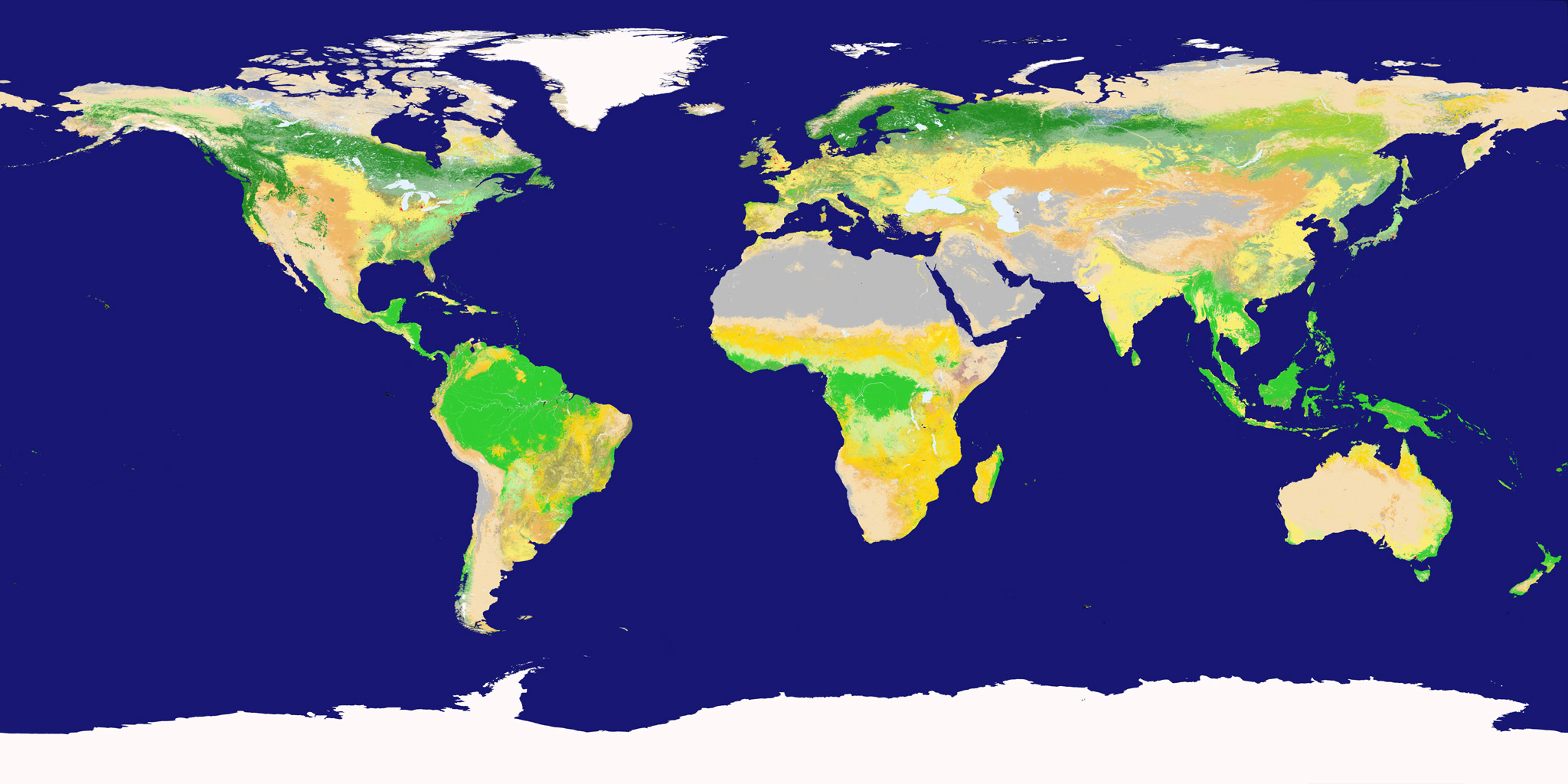
I have been trying to make a "human population trails" 2K-BAM world map, but most of the search results brings up either population density maps, maps that are extremely innacurate (such as showing places like Yakutia as having no people living in it, when this is just incorrect, and overall contradictory and low-resolution maps.
I have been trying to make a "human population trails" 2K-BAM world map, but most of the search results brings up either population density maps, maps that are extremely innacurate (such as showing places like Yakutia as having no people living in it, when this is just incorrect, and overall contradictory and low-resolution maps.
Last edited:
Perhaps a land cover dataset like MODIS would be a helpful starting point. This particular one purports to distinguish blocks with at least 30% construction or 40% cropland from less developed ones, so it is going to miss some residences.Does anyone has either a world map showing the *completely* uninhabited regions of the world (that is, not even places with no population density, I mean places that there are absolutelu no humans living in), or a world map showing all of the directly human-inhabited areas of the world?
I have been trying to make a "human population trails" 2K-BAM world map, but most of the search results brings up either population density maps, maps that are extremely innacurate (such as showing Yakutia as having no people living in ot, when this is just incorrect, and overall contradictory and low-resolution maps.
Alright so I am too low IQ to understand anything about this website, I cannot find a full world map on it anywhere, I keep clicking on the many links but a world map just never shows up, also at least for the moment, it does not needs to be meticulously detailed and big to the extent it'd crash my browser.Perhaps a land cover dataset like MODIS would be a helpful starting point. This particular one purports to distinguish blocks with at least 30% construction or 40% cropland from less developed ones, so it is going to miss some residences.
Edit: I just found a MODIS map with the exact same projection and pixels as the 2K-BAM, but I dunno what I can make of it, since I am just looking for places where no humans live in.
Last edited:
Does anyone have a QBAM of the San Stefano Treaty? Specifically the Caucasus area that was given to Russia.
I tried a few different designs, from what I understand Arcasia is an analogue of the United States, so maybe I can try a few more designs which incorporate the stars, which are a distinctive feature of the American flag, but you asked for a less busy flag.I'd like to request a redesign of the Arcasian flag from Suzerain. The official version is way too busy for my tastes.
Republic of Arcasia - Suzerain Universe Codex
Discover the key features and challenges of Arcasia, a constitutional republic in Western Merkopa. Led by President Dwight Walker, this global superpower boasts a formidable economy and a strong commitment to capitalism. However, with concerns surrounding
I think the stars are the main element that make the flag so busy-looking, so to keep it as simple as possible I started with designs which don't use stars.
This first one uses the NATO type star as a central roundel, and simplifies the fimbriations around the cross.
The next two keep the more busy fimbriations of the cross, and incorporates the NATO type star into the cross itself without the use of a roundel, with a version being more asymmetric to make it look like the star is more incorporated into the cross, and the other keeps the star's proportions strictly symmetrical.
Please tell me what you think, I can adjust as you need.
So many ideas, Marc Pasquin's is especially interesting.
Could you take the first flag and make it so that the compass star doesn't touch the outline of the circle? Perhaps come up with some other star that doesn't correspond to NATO so directly?Please tell me what you think, I can adjust as you need.
Why not, let's try that. Perhaps the stars could be different from the standard thin 5-pointed ones?
Or perhaps another version with no roundel, but stars arranged in some sort of circular pattern? Tried doing that once, but it didn't look too good:

Or perhaps another version with no roundel, but stars arranged in some sort of circular pattern? Tried doing that once, but it didn't look too good:
I came up with a few new designs which I quite like and think look good and close to the original but less busy.So many ideas, Marc Pasquin's is especially interesting.
Could you take the first flag and make it so that the compass star doesn't touch the outline of the circle? Perhaps come up with some other star that doesn't correspond to NATO so directly?
The first one is based on your request to make the compass star smaller, and I changed the design so it is different from the NATO compass star.
I like this next one because it incorporates all the elements of the original, stars, compass star, but arranged in a way that it isn't all in one place making it look busy. The compass star goes on the upper left quadrant, and the stars are geometrically arranged and are the lone central element unencumbered by the compass star. I also gave the stars a different four sided look in order to keep with the compass star theme, but instead of eight points like the main compass star I made it four pointed so it would look a lot less busy and better, and congruent with the rest of the design. I wanted the stars to not be a copy of the American vexillological design philosophy, so four pointed looks better, unique, while still keeping in with the spirit of Arcasia being more or less an analogue of United States.
Please tell me what you think, coming up with these designs is a bit more work than I thought at first lol.

EDIT: I made another adjustment, I changed the compass rose to look more like the one on the original Arcasian flag!
Last edited:
Those 4-pointed stars look very good. I wonder, would this design work if we had a diamond or a hex in the middle instead of a roundel?
I would but your request is out of my area of expertise, I mostly make maps, I am sorrynot to be rude, but would someone please take a look at my flag above?
Okay. Well, if I ever have the datasets needed for a map, I'll make sure to ask you about it.I would but your request is out of my area of expertise, I mostly make maps, I am sorry
Those 4-pointed stars look very good. I wonder, would this design work if we had a diamond or a hex in the middle instead of a roundel?
Those 4-pointed stars look very good. I wonder, would this design work if we had a diamond or a hex in the middle instead of a roundel?
I made this quickly but I think it looks pretty good.
Attachments

Last edited:
Share: